SQUALE 1521 'BRONZO' 50 ATMOS
By Squale Whale
I have owned too many Squale. Embarrassingly, it must be getting close to 100 that have now visited my wrist. And, as the lollypops and paddles have ticked round the dials, my taste has ever strengthened for pre 1995 100 atmos Masters. But, it's one of the modern 50 atmos watches that has played on my mind for years: the 1521 Bronzo.
There is something beautiful about the way bronze watches age. If you don't mess around with them too much, they will gently react to their owner's skin type and lifestyle; eventually darkening from their intese 'gold' finish to anything from a rich brown, to a deep rose-gold and, for some, a grungy mix of blacks and powdery greens.

The one thing that has always put me off throwing down the cash to buy one, is the placement of the crown (and date) at 2. It litterally drove me insane for years. I wanted a bronze Squale, but I just couldn't stop thinking about how odd the crown placement was. But then, a few months ago, I bought a Destro fat-case Berios Master that has the crown at 10. And after a while, it didn't seem so odd. And if I was comfortable with that, why not at 2?
The descion was made. I was going to get a Bronzo. But which one?
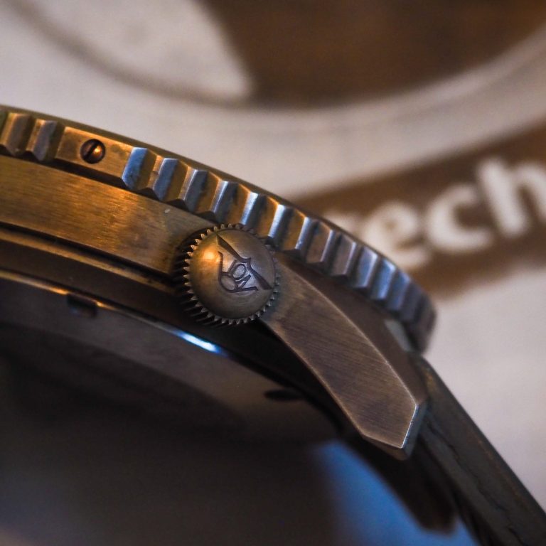
There are, at the time of writing, three versions of the Bronzo - and I'll get into details about each later. I was tempted by the latest 'BL' version (as it has such a unique, refined, and modern design), but I've never been a fan of blue bezels. With all the Masters I own, not a single one features the blue acrylic. So that 'BL' was off the table.
And, for me, the dial colours of the second version have too much pop against the black ceramic bezel, and kind of outshine the bronze case. So that left the original; the Bronzo first released in 2018, whose key unique feature is the lume-filled bronze bezel insert.
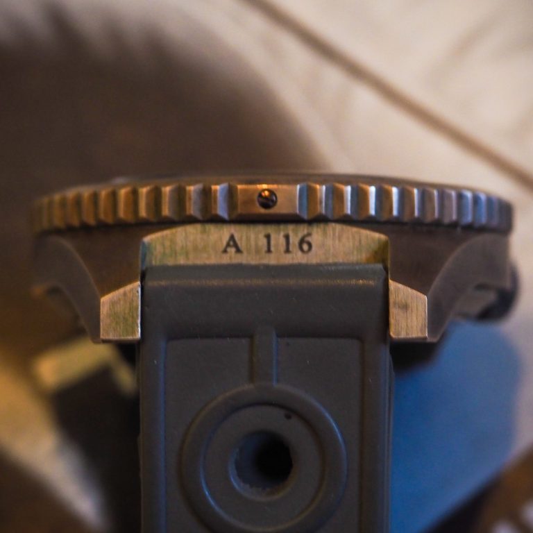
There are two variants of the mk.1 Bronzo: the ginger dial and the anthracite; and both feature the same high level of attention to detail which I will get into in a second. The instant winner for the collectors out there was the ginger dial (thanks to its warm radiant shine). But, for me, the winning finish is the anthracite as it doesn't outshine the bronze when the metal case builds its unique patina.
As mentioned, the dials feature some unique details: this was the first 1521 dial to feature applied indices (and they are finished so well that they gleam when struck by light); along with the C3 filled batton markers, there is an interesting arabic '12' at the top; and these sit on a sunburst dial with a very neat 3D guilloche edge ring.
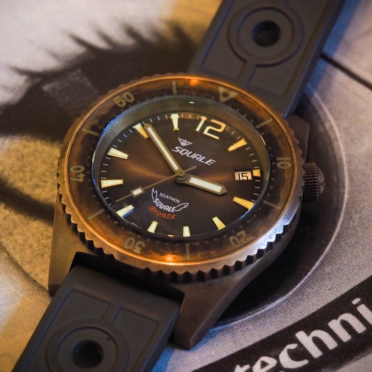
The dial really does play in the light and is quite magnetic to look at. Sometimes it looks moody and brown, and other times, when the sunlight strikes through the domed sapphire crystal, the dial radiates a vivid grey tone that almost ventures into the lavender shades.
Another nice detail that separates the two designs is the treatment on the hands. While the brighter ginger dial features brushed hands that sparkle, the anthracite sports matte bead blasted hands for a more subtle look.
There were 65 made of each version, making a total first run of 130 watches - so these will become quite rare as time slides by. And each has its unique serial number stamped between the lugs.
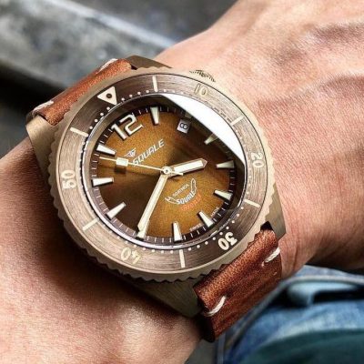
The ginger dial mk.1 has more 'bling' than the slightly less popular anthracite version that I bought. It really is a stunning thing of beauty, but I feel its gleam outshines the dulling bronze case.
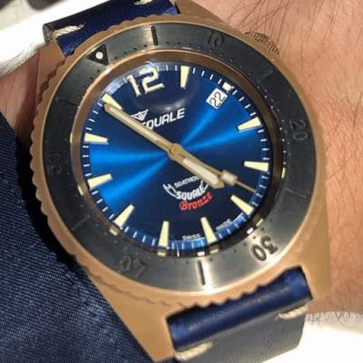
In 2019, Squale released a second version, with 100 available in each colour variant. These feature very similar design elements (same case, crown position, and general dial design as the mk.1) and yet they have a very different look, as you can see here on this sapphire blue 1521 that has serious punchy 'pop'.
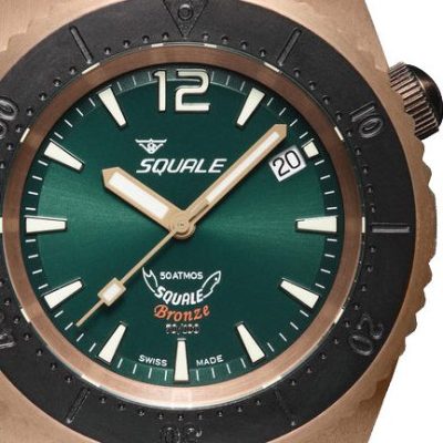
Even on this emerald green version, the dial colour is much bolder than the mk.1. And, matched with a black ceramic bezel insert with no lume infill, it gives a much bolder look than the radiant but subtle mk.1.
One feature on the mk.2 that some will love (and others will hate) is that the limited edition number is actually hand applied to the dial below the red 'Bronze' script. Personally, with such a beautifully finished dial, it feels somewhat cheap to apply an LE number. But even if you don't really like it... it's a tiny detail that is hardly noticed.
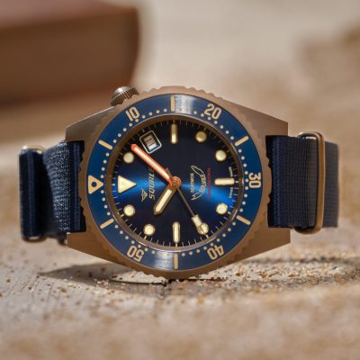
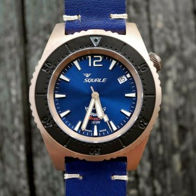
The freshest and most modern design is the mk.3 'BL'. Squale steadfastly hold onto the same 'crown at 2' case design that so many watch fans seem to hate. But... if this design can eventually win me over; it can win anyone over; so I applaud Squale's stubborn approach.
The dial on this mk.3 'BL' is just beautiful. It loses the arabic 12 marker for a more tarditional Squale triangle. And it also loses the 'Bronze' script for a natty red 'Professional' tag, as you would expect to find on a 1521.
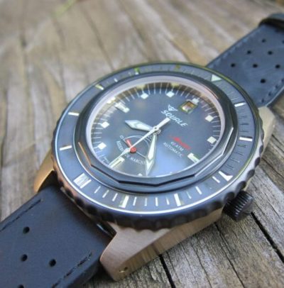
If you prefer something a little larger, Squale also produced two other bronze case options. The next size up is the unusual 43mm Milano Master; a 60 atmos piece released in 2015 that was limited to a maximum of 300 pieces (but I doubt 300 bronze versions were made, let alone sold). They are of exceptional quality, and feature an acrylic bezel insert based on the Master or old, but without the traditional sword hands or orange minutes... it lacks that Squale vibe.
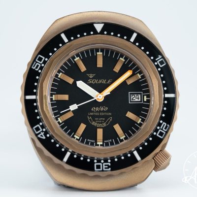
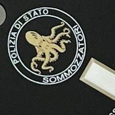
Larger still is the 44mm Squale 2002 Bronze released in 2018 that was limited to a maximum of 60 pieces. It is based on left over 101 atmos cases that were made for the Italian Polizia Di Stato (aka Polipetto), but does not feature the Sommozzatori Octopus logo on the dial. And for those that did not like the Limited Edition numbering on the dial of the mk.2 1521 Bronzo, this also has similar markings at 6.
THE BIRTH OF THE MASTER
By Squale Whale
Squale was not first to the table with a dive watch... not by a long shot. Indeed, by the time Charles Von Buren moved on from push-in crown skin-divers and started crafting his screw-down 'Supermatic' series, Omega had already produced 30-years worth of 'dive watch' designs (I guess you should actually think of these early pieces as 'waterproof' rather than 'dive' specification). No, Squale rose to fame not for being first but for being best. You see, these early watches, emblazoned with a proud 'Von' crown on the crown, quickly built a reputation for being ultra-reliable, extremely good value and, considering their tool watch status, utterly stunning in design and finish.

In the early 1960's, his asymetrical Supermatic watches were leading the booming dive watch market, and so far comprised of: the tough yet cheap steel-bezel 200; the gorgeous 250 with its stunning acrylic-bezel insert (as in the picture above); and the top-tier professional-spec 300 with anodised aluminium bezel. But Charles had dreams of Squale dominating the dive watch arena, and set to work developing the ultimate diver's watch; the 'Master'.

Here is where the waters get a little cloudy and the story seems to take some random tangents before we reach the first Master being sold in 1965.
From the research we carried out, it is clear that Charley was a very busy boy in the build-up to the launch of the first watch to carry the 'Master' branding. He not only came up with ideas of his own, but also reached out to specialist Swiss watch case manufacturers to see what ingenious designs they could develop to ensure the next Squale would truly be a market leader in both performance and design.
It's also clear that Squale must have benefited from investment at this point, as the volume of watches being researched, developed and produced ramped up massively. While production of the Supermatic skin-divers continued, Squale also created the 'Super 300' 1510 (a watch that has a crazy 'Von' branded Helium Escape Valve crown); launched the beefy 'barrel' cased 600 series (a forerunner to the 2002); and also designed and built a 'secret' 75 Atmos 1522 (pictured above). While many of these 1522 were made, few were ever sold. You see, at the time manufacturing began, other producers developed plans for a 100 Atmos watch. And why bother with a 75 Atmos if you can market a 100 Atmos?! More is better in marketing, right?!

Here is where it gets a little crazy. It seems that by the close of 1964 there were competitive watch designs from two Swiss case manufacturers that could both deliver a watch with the target '100 Atmos' depth rating. Von Buren and his team could obviously see merits in both the different designs, as orders were confirmed for not one 'Master' but two, and each factory received their unique batch of serial numbers.
Adding to the confusion of this story is the fact that the first 'Master' to hit the market in 1965 was from the manufacturer that was issued with a higher serial number range. So while it looks to (us nerds) who study serial numbers that the all new 1521 was next in line to hit the market, it was actually the asymmetric Supermatic (pictured above) to claim first place on the 'Master' family tree.
Now, while this version was first, the 1521 followed shortly after and, to add to the identification conundrum, Squale built some watches up with a mix of parts from each range (so the 1521 100-Atmos can be found with a Supermatic dial, etc.). However; cases were always matched with the correct case back, and so the Supermatic Master should be identified by its engravings... "1000 Metres".

Even today, creating a watch able to survive 100 atmospheres is difficult; huge seals and thick crystals are required to withstand the pressure. That said; the '1000m Master' is no ugly tank... no, this is the older brother of the 200, 250 and 300 Supermatics, and features a similarly curvaceous asymmetrical case with softly drooping lugs. Most feature polished and brushed surfaces, a few are fully polished, but all feature stunning bi-colour acrylic bezel inlays set with chrome markers and unpainted sword hands.
The '1000m Master' remains one of the most beautiful dive watches ever made, and many consider it to be the most iconic Squale of all time.
The diameter of the 1000m Master is 40.5mm (excluding crown); has a lug-to-lug of 47.5mm and a lug width of 20mm; and, while it looks so svelt and is easy to wear on the wrist, the design hides a case height of 16.7mm (although this drops to 14.5mm if you exclude the high dome of the plexi).

At this moment in time, Squale was mainly a supplier to other watch brands (like Berios, Nileg, Itraco, and many, many others) so the rarest '1000m Masters' are those that feature the Squale brand at 12, and these rare beasts carry a price premium as they are targets for the serious collector.
There are two variants of the Supermatic 1000m dial to look for; the 'simple dial' (as per silver dial above) that featured applied markers at 12, 3, 6 and 9, combined with square lume plots at all other points; and the 'fancy dial' (like the Itraco below) that sports applied indices at all hours and 'Master' printed at 6. Both versions are considered desirable and run the same skinny frame hands with lots of tritium lume.

Now... as beautiful as these curvaceous '1000m Masters' are, they fell victim to the brash, angular and sharp 1521. And while this new 1521 evolved over time (and remains on sale to this day), the Supermatic series died with the slick 1000m Master. In this real life story, 'the beast' killed 'the beauty'.
So, mere months after the stunning '1000m' was released to the public, in struts the 1521 with its thicker, sharper and more steeply angled lugs (just like the 1521 of today, but slightly smaller and with its crown positioned at 3, not 4).
This version has a caseback engraved with the word "MASTER" within a circle of waves, and a dial printed with a slightly less shouty logo along with a line that defines this version of Squale Master: '100 Atmos'.

One hallmark of this '100 Atmos Master' (beyond its case shape) includes a feature that, after nearly 60 years, lives on as design element synonymous with Squale watches; the orange painted minute hand.
Squale was sponsoring many world class free divers at the time; and I can imagine Jean Tapu suggesting to Charles that he should make the minute hand more legible in low-light situations; a simple and somewhat obvious comment that set a Squale brand value in stone for over 60 years.

The acrylic bezel inserts of the 1521 '100 Atmos' are usually black and printed with luminous numbers. Again, this shift away from the 'pretty' to the 'purposeful' would have given a huge boost to legibility in deep waters - especially after the luminous numbers had been charged in the summer sun - and was most likely a change driven by feedback from diving professionals of the era, like Maria Treleani and Carlo Gasparri.
However, there are a few dark blue inserts out there, and the design everyone seems to covet; a bi-colour black/orange. Indeed; this is a Squale that eludes me to this day. But it will be mine, oh yes; it will be mine!
The diameter of the 100 Atmos is 41mm (at the bezel... the case runs 1mm smaller); has a lug-to-lug of 48mm and a strap width of 20mm; hight wise it is even taller than the 1000m at 17.5mm (but again, the plexi dome is a large chunk of this, and reduces to 14.2mm if measured to the bezel top).

The '100 Atmos' is a much more modern looking piece. It's way more masculine, too. But because of that, it doesn't quite have the attractive charm of the '1000m'. The 100 Atmos clearly means business, and, to be honest; it kind of set the tone for how a dive watch should look. I mean, if you asked a watch nerd to close there eyes and imagine a cool dive watch, they would unwittingly imagine something with a simple dial, orange min hand, and bi-colour bezel. The look of this 100 Atmos really is that iconic.
In my mind, it's one of the most under valued watches on the vintage market. I can guarantee you this; the price band for both these early Masters will rightly escalate rapidly over the coming years.

Anyway, the sales of the crown-at-3 1521 '100 Atmos Master' clearly won out. The more feminine '1000m' was laid to rest, its soft lug case never to be seen again (although the dinky 'Medium' did follow its asymmetrical shape in a scaled down form). And the stage was set for the launch of the bigger, bolder, crown-at-4 'mk.2 Master'. But that's another story...

Dials made in the 1960's, especially the sun-ray type, are fragile. Damage to the finish from water ingress and exposure to strong sunlight is common. Some people love this kind of patina. But if you don't, be aware that a good redial is extremely expensive and, by collectors, will always be regarded as inferior to the original. So only go down this route if the dial is totalled.

One thing both 1000m and 100 Atmos Masters share is the movement inside their case; a Felsa 4007 automatic. This is a rock solid self-winding workhorse that should serve you well over a lifetime as long as you occasionally look after it with a skilled clean and lube.

There are a few 1521 '100 Atmos' variants out there with acrylic insert that differ from the norm. While some consider them to be altered, they are actually factory correct, as their existence is proven within Squale advertising of the period. This Berios is one such piece owned by insta user 'Iago__55'.

The mk.1 Masters all came with high dome plexiglas crystals. Being quite soft, most of these carry battle scars. Not a major issue, as small scratches can be polished out using Pollywatch paste. You should not go diving with these vintage pieces, and if you can see feint stress cracks under strong light... irreparable damage will follow shortly after your first dip.
Replacement crystals are no longer available from Squale. Some of those sold privately are not the right height, so try and keep the original if you can. See the Nuggets page for more information.

Squale mostly made the mk.1 Master for other brands, like this stunning Tavernier. Other brands to look out for include Agena, Arten, Ausal, Altanus, Berios, Bermont, Blandford, Bondix, Carlson, Droz, Eaglestar; Flica, Itraco, Kaster, Margi, Melpier, Naver, Nileg, Potens, and Ticin.

In a final flurry before it was killed off, there were a few special 1000m Masters released adorned with machined metal bezels. These are exceptionally hard to find, but you can sometimes get a right bargain as many collectors prefer the acrylic inserts.

A killer Altanus owned by Justin Vrakas. Correct hands and crown, perfect 'basic' spec dial, and rare single colour insert... a collector's dream in stunning condition! If you see something like this for sale; don't dither or delay... buy it! You probably won't get the chance again.

After 50 years of exposure to salt water and sunshine the acrylic bezel inserts will often show signs of ageing. This is not a problem. Cracks, discolouration, and scratches are all part of the watch's history and charm. But be aware: no replacement inserts exist, so avoid any with chunks of acrylic missing or those that are peeling away from the bezel. I await to see a good repair.

As mentioned earlier, it seems many of the 1521 '100 Atmos' Masters used certain parts from the '1000m' bins. This stunning '100 Atmos' Master features a dial normally found in the 1000m Supermatic. This is not a fault or franken... it is perfectly how it left the factory.

It is very common to see these old Masters with the wrong crowns fitted, like on this 1521 variant. If it does not have the Von logo embossed on the crown; it is not the original crown. However, as long as it remains of the same design as the original; it is acceptable.

An advertisement from the late 1960's promoting Von Buren's revolutionary Squale Master. The jingly-jangly folded metal bracelet seen fitted here are now super rare. Indeed... I have yet to actually see one myself.

In the 60's, Squale sold their own watches through dive shops, not jewellery stores. They were tools, not trophies. So don't expect to go finding fancy boxes from this period; they don't exist. Quite sad really.

So just how big was the shift in design from the 1000m to the100 Atmos Master? Well, anyone who has seen a mk.2 1521 will know how much more angular the case is, and how much longer and more more steeply angled the lugs are. As a stepping stone, the 100 Atmos Master adopted all but the 4 o'clock crown.

An old advertisement showing the '100 Atmos' tagged as the 1521 even though it had the crown at 3.

Another old advertisement showing the '100 Atmos', note in this case it is 'nude' with no branding at 12 (as would have been shown to other watch brands who would place their own marque there. And also the bezel insert which is possibly the least seen variant there is.


1521... THE STORY... SO FAR...
By Big FFish
In 1967, when Lamborghini presented the outrageous Countach to the world, everybody understood that the looming new decade required a new definition of design. And, with the turn of the millennium in reachable grasp, an optimistic belief in the future paved the road to a revolutionary approach to product design. The conquering of space, breaking of the sound barrier and a new, open and free society required new identities. The known and the worn were replaced. And so, just as Bertone drew hard and edgy lines on the LP 400, the design team of Squale sketched a brand-new shape. Sharp accentuated case lines tapered into facetted lugs, with a massive heft and, most importantly, sporting a sleek droop to the location of the crown.

For safety reasons, the creative heads shifted the so far unprotected crown from the 3 o'clock position down to 4, recessed it into the case and thus prevented further loss of precious time pieces due to careless underwater movements of a diver's arm unwinding the crown. Rolex solved this issue early on by adding a crown protection guard, which was part of the Sport models since the 60's. Almost all other brands took the pending issue of a 'knock-off' far less seriously and worked with screwed down yet exposed crowns.

The increased bezel diameter of 42mm also set new standards in a world where men still wore smaller timepieces, well hidden under their sleeves. But new times require new symbols, and a boost in outdoor exercise and newly developed recreational activities (from top of mountains to the bottom of the sea) increased the sales of virile chunky sport watches. A market Squale not only arose from, but actively mastered for the past 10 years. The race for the first waterproof watch with a depth rating of 1000m was already integrated into Squale’s heritage.

To celebrate the discarded outmoded 60’s, Squale HQ also knew that they required something fresh in their quiver. So, in the early years of the recently heralded seventies Squale presented the 1521 reference. Early prototypes sported the name Squale 500 boldly on the dial; a feature quickly abandoned and replaced with the well-known dial layout of today. For marketing trials and technical curiosity, Squale also experimented with full-lume dials, bi-color acrylic bezel inlays, solid metal bezels, applied metal indexes and shape of lume plots.

One reason for an early success of the 1521 for Squale was a shift from their traditional business model of selling watch cases to other brands and their own watches via dive shops, to the time-proven distribution through faithful jewelers and watch shops. To inspire the jewelers to take stock of these brash dive watches, Squale would even arrange to have the store’s company name or logo printed prominently on the upper part of the dial and rely on the recognisable Squale trademark to do its business on the lower half above 6.

During these exciting times, the German Navy was in need of a new timepiece for their dive commandos. With the outcome that the responsible branch in the Armed Forces Bureaucracy Dept. knew nothing of Squale and so contacted Blancpain (purveyor of military watches in the past) instead. The classic Fifty Fathoms model was not fulfilling all demands, so Blancpain reached out to the specialist of deep dive watches down the road and, in 1976, the Manufacture d'Horlogerie Rayville S.A. in collaboration with Squale delivered the ordered "Tauchenuhr für schiffstechnischen und allgemeinen Taucherdienst in der Bundeswehr". Or in simple words: a dive watch for maritime service of the German Army. Since these watches were never intended for public knowledge or acquisition, we can further assume that only much later was the Fifty Fathoms BUND declared a family member of the 1521 tree. But is today, with its provenance and military connotation, the most important relative so far.

As a little side note: Blancpain created a small number of civilian FF Bund watches missing the red 3h circle on the dial. On the civilian case backs, we spot the famous reference 1521 again, creating yet another question in the mind of a nerd; as the reference was not accompanied with a Y like many other Squale; just the four digits ‘1521’.

The accolade of the BUND edition encouraged Squale to further broaden production and so released two fraternal twins: the 50 Atmos and 100 Atmos models. The latter being equipped with a sturdier crown (made of brass), better gaskets and a high dome Plexiglas crystal in order to achieve the ambitious depth rating. Since pricelists and catalogues of this period are scarce, unfortunately no information is available regarding potential retail price differences and marketing strategy regarding the Gemini.

During the next few years many different models were manufactured; a treasure trove of dial variants, bezel colours, and playful small-batch mutations… blowing up any attempt to “catch ‘em all”. The 'vanilla' bezel was a classic black acrylic with luminous markers. But we find various shades of blue and, of course, the sportive and now ultra-desirable mixture of black/orange. These are on all 1521 models, and always produced with black upper and orange lower half circle. Only for the Breil Manta editions was an insert manufactured with the first quarter in orange and three quarters in black, not unlike the very similar looking MRP watches from the same era. All other fancy bezel colour craziness was reserved for the 600 and 2001 models (and the medium sized Y1545 and Y1515 references).

The demise of Swiss watch making finds its roots in the search for the future. By establishing reliable, chronometer-spec quartz movements, mass production was suddenly possible… and cheap timepieces flooded the market; almost extinguishing traditional manufacturing of high quality.
To satisfy their clientele, Squale offered the 1521 series in both movement options and, for easy identification; equipped the Quartz models with a straight second hand (missing the now familiar little paddle). Some of the Quartz models also had block indexes instead of the normal 'buckshot' dots, resembling their big sister; the BUND FF.

Surviving the Quartz crisis and taking the subtle but important step into the 80's, market demand changed again: big chunky watches, especially anything resembling a Submariner, was frowned upon and the new 'yuppie' generation found effeminate watches to much better underline their lifestyles. I would assume that commercial decisions combined with a different market vibe are the reasons behind an overhaul of the case design. But maybe it’s a direct result of reduced movement heights of the new workhorse by ETA? Anyway, the once bulky FF case underwent surgical intervention, and the result was astonishingly the same harmonious ratio and dimension - just seriously thinner and easier to wear.

Another significant change was manifested in deleting the warm yet brittle acrylic bezel inlays. The replacements were (as seen still today) easier and cheaper to produce and replace. These new inlays were made from aluminium and featured a little tritium blob facilitating readability (in theory). The redesigned facelift of the 80's 1521 relinquished all ornate color variations and self-contemplated on the basic bread and butter black dial, black bezel, stainless steel or black PVD finish. This stern appearance sprung the even more austere Italian Navy into action and, once again, Squale was selected to furnish elite underwater commandos with special order watches.

The now much sought after Marina Militare editions are exceptionally rare and I suspect that like their fraternity of French and British Military for a large part are forever lost due to the extreme conditions they have been subjected to. We know of three different decommissioned variations: a black PVD case with large yellowish MARINA MILITARE script replacing the normal Squale branding, and two stainless steel versions MKI and MKII with both a smaller MM print underneath the Squale brand.

Some of the early MK1's are equipped with the susceptible acrylic bezel, while all PVD cases already show the aluminium inserts. Due to a lack of available watches for comparison there are no substantiations for a continuous batch of serial numbers. If you are one of the lucky owners of the MM's please feel free to reach out and share additional information; we will handle all data with the utmost privacy and confidentiality.

Squale watches have born individual serial numbers throughout the years and references; ranging from 4 to 6 digits. If you compare available information found online, it seems that there is no inherent logic indicating batches of similar watches. No, it seems randomly assigned consecutive numbers thrown at whatever left the company on that particular day. With the early FF 1521 we find the serials between the lugs, sometimes at 12, and sometimes on the other end. During the final run of the thicker FF case, not unlike some 2001 models, the serial was stamped in the flank, opposite the crown. This final run of the thick FF case models was sold with engraved stainless-steel bezel and redesigned dials. Heck, just to confuse... a few left the factory with no serial at all!
The continuous numbering system was abolished in the early 80's and replaced by a six-digit serial starting with the number 8. Coincidence or not, all serials on the slimmer 1521 models from that period are stamped 88xxxx. Again, if you have information to further elaborate on this, please share with us.

We are now entering the final years of the original Squale S.A. - do you remember the early years of the 90's? The world of watches was dominated by the ingenious invention of a plastic quartz phenomenon called Swatch in all its gaudy charm, interchangeable flexibility, and affordable price. It also signifies the time when old style tokens and symbols of affluence reappeared on the wrists across all age groups, when a Submariner became fashionable again, and was seen worn simultaneously with a Swatch - the latest craze and double wham show off. Personal data of Mr. Charles von Buren are not publicly available; yet when contemplating daring pictures of the founder of Squale S.A. at the helm of a sailing yacht what must have been the roaring 60's, we can assume that he must have turned 70 by now and the daily business plus the demanding last decade must have taken its toll on the great gentleman, diver, entrepreneur and visionary. With no surviving archive of Squale, we assume that in 94/95 the company closed and the factory fell into a slumber.

Fast forward into a new millennium, and to the year 2008: the close confidant and former distributor, Signore Andrea Maggi, had taken over the Squale premises, stock and inventory and started anew. Assembling original cases, movements and dials found in drawers and on work benches, Squale rose from the considerable layer of dust with a collection of - you guessed it - a brand new collection of 1521 watches. To be precise: one watch! NOS cases, click-on bezels with the old NOS inlays, Tritium 'skinny' hands and dials and most importantly the black Cerakote rehauts, not found on any other generation or edition of 1521 before or after. They came in blue plastic boxes covered in felt, most probably leftovers from more lavish times, garnished with rubber straps and satinated titanium clasps. Some old stock blue hangtags brought it all together and not unlike Randolph in "Coming to America" Maggi shouted: "Mortimer, we are back in Business".

Watch fairs in 2009 and 2010 created new distribution partners worldwide and production picked up remarkably: fancy dials in blazing orange and warm yellow, experimenting with some blue sunray dials, housed in stainless steel or durable PVD coatings were suddenly seen from NYC to the far east. Better yet, the proven and lucrative idea of co-branding became part of the renaissance: Alessandri in Santa Margherita Ligure and Mantovano are two examples from Italian distributors.

Interestingly enough: from the same time period another military watch emerged in an infinitesimal small batch: The Brigata Paracadutisti "Folgore" that had a PVD coated 1521 manufactured with their Coat of Arms prominently dominating the dial. Only a few NOS pieces reached the open market and we are extremely grateful for any substantiation of these watches. Especially worn pieces would be exceptionally helpful.

Next up and noteworthy are a batch produced by the Far East distributor, BEAMS, for the Japanese Market. The easily discernible watches have three particular peculiarities: a domed sapphire glass is one, the reversed coloring of the minute and hour hand constitutes the second difference. The characteristic orange minute hand for easy reference under water, is painted white and the hour hand received the honors of the bold coloring. These watches were sold with black, orange, yellow dials, and the black dials are executed with a shiny surface, something also not seen before. BEAMS also ordered Alu bezel inlays with reference to the wild 70ies: 15-minute markers in orange, yellow or grey, complimenting the dial color and adding a spritz of fancy.

During the years 2011/2012 Squale added another level of finishing and engraved the brand moniker on the outer flank of all cases. Since its disappearance in 2020 due to negative feedback from watch blogs and reviews, it seems to have found late appreciation and some models are especially in demand with the extra name.

Squale was open to a lot of experiments and special 'limited edition' pieces popped up in regional markets for short periods of time. Like the Camouflage Edition being released in Italy and Japan. While the Italian version came in a satinato case and had uniform blue or black bezels, the Japanese edition, see above, sported the domed glass and ¾ bezels in grey and black. The dials came in desert brown and blueish hues, the multilayered coloring is amazing if viewed in direct sunlight.

The heavily involved Italian distributor Horus was also very creative, releasing special editions in ceremony of the recent world records of Italian free dive world champion Alessandra Zecchini. A miniseries was embellished with her signature below the Squale sign, and another was personalized with a female diver blowing bubbles on a sunray blue dial.

Also noteworthy are the experiments with Arabic numbers instead the common lume dots. A white dial version appeared on the market, and a Dutch watch collector club commissioned a limited edition with their regal orange colored dial and club name. Other, less cherished examples, include a TGV edition with burgundy inlay and a grayish dial.

Special note on the collaboration with Singaporean distributor and Influencer, Gnomon: this very successful dealer initiated some very interesting limited-editions and is closely linked to modern Squale: not sure if considered a "true" 1521, Gnomon is creator of the ONDA series with metallic shiny dials in various colors and full black inlays. Furthermore, they regularly introduce special models only available through their website. Diver Down, LAB01 are the two that come to mind, with more to follow.

Inspired by this success, Amsterdam based dealer AWCO offered an inhouse limited run with both green and red dial, executed with vibrant sun ray dials which quickly sold out. But AWCO will be forever remembered for their homage to the one and only BUND: in two separate editions they created two amazing, limited editions of the 1521 with C3 markings in red. One came without date, the second edition with date, square markers and the red circle are the closest you can get to the infamous Fifty Fathom military time piece without investing 5 digits in hard currency.

But I am getting ahead of myself... let's wind back to 2014. A time when the stash of NOS parts had been run down to a small batch of slightly beaten up cases. British dealer Page& Cooper initiated a crude sand blasted case edition which led to the “Super Matte”... this hid the storage marks, and gave a tough look similar to when the PVD falls off a vintage military model. The P&C variant was a LE run of 20 watches, but led to Squale developing the 'satinato' look so popular in their modern range.

Soon after, Gnomon 'got jiggy' and released the 'Opaco Originale' Edition with a total production of 99 pieces. The pastose hand applied lume is adding a three-dimensional quality to the mesmerising dial, with its red shark branding. The Case is blasted matte, Bezel is BUND style with only the luminous triangle for longer saturation dives and also note the red painted tip of the second hand. This beast was quickly followed an all new Squale introduction; the Militaire. This three hand watch, reminiscence of the glorious days of the original Bund 50 years ago, played in a similar league.

Welcome to the world of today. Since around 2019 things have cooled down, less experiments are conducted, fewer tests released, and rarely do homage or truly new watches find their way to the market. Noteworthy are the return of the full lume dials from the archives: first in yellow greenish Luminova, then initiated by Italian Jeweller Majer in milk white, which led to a milky white full lume Militare edition just recently launched in May 2023. Some folk mod these pieces with sapphire inlays that hark back to the acrylic of old.

In 2019, celebrating their 60th anniversary, Squale produced two different watches with a special dial. The important one here being a 1521, and in this instance it featured a hand finished dial with either large lume plots set inboard, or smaller lume plots connected to the seconds markers. Limited to 60 pieces, and with a specially engraved case back, it is one of the must haves for any 1521 collector.

Since 2020 we saw a handful of limited editions... a ginger dial edition for an Italian forum of 30 watches...

...a blue sunburst edition for a Polish watch forum with applied steel indexes...

...a full green Hong Kong piece with 100 numbered watches...

...and a nuclear orange full lumen PVD eye-catcher produced in two runs of 50 each...

Certainly, the cherry on the layered Squale cake came in the form of the COSC certified variant: having spent arduous days and nights proofing its accuracy, the movement receives the prestigious seal of the independent laboratory in Bienne (CH). For easy reference, the dials are upgraded to round metal markers and the COSC text proudly replaces the well-known shark logo.

Well, that just about brings us bang up to date. I suppose the last picture ought to go to the 1521 you though I'd forgotten about... the three fumoso; the Red Passion, Blue Soliel, and Green Sunray. These were proper hand-made heat-treated dials, not cheap painted copies. Hunted by certain collectors, a little bright for others; but they sure have character.


THE 'VINTAGE' MASTER
By Squale Shark
Seeing as you are here on the TSC website, the 'Vintage Master' will need little to no introduction; being one of those target grails for Squale collectors around the world. But just in case you don't know the full nerdy lowdown; here is the info...
Page & Cooper was a watch retailer in the UK run by two watch enthusiasts that have long since gone bust. The team there had a good eye for design and some fine ideas. And, not long after producing the 1521 SuperMatte (a watch that led to Squale making the bead-blasted 'Satinato'), the managers visited Squale HQ in Milano. And it was on this adventure they happened upon a draw containing a bunch of NOS spare acrylic bezels for the mk.1 master produced in the late 60's.

They convinced Andrea Maggi to use the bezels to create a run of 60 special Limited Edition Master watches; 20 black/black with black dial, 20 black/blue with blue dial, and 20 grey/grey with silver dial. All made in Switzerland in custom made cases, with special dials and hands, and topped off with the stunning NOS acrylic bezels.
The prototypes were numbered 01 (grey), 02 (blue) and 03 (black) and, as these were used for press photography, they had the bezel inserts with least imperfections - all others have small imperfections, but this adds to their unique flavour.

A little known fact is that there are 10 more out there. Un-numbered examples that were made to sell through a Milano based dealership. And these too have exceptional bezels, but do not come with the special roll, penknife and other goodies supplied with the Page & Cooper watches, and are not number engraved on the back.

Of the three colour variants, most chatter online is about the blue dial; so I guess that makes this version the easiest to sell... and the hardest to buy.
The black dial and the silver dial reach out to different people with opposing tastes in design. The black certainly has the meanest look, but the silver caries the most vintage feel of the bunch. And, to be honest; you'd be lucky to own any of the variants.

Tracking sales values of these watches is quite difficult. One sold on eBay recently for under £1000, but that lucky guy (how are you doing Squale Shark?!) got an awesome deal, as the two that have sold since then, both went for over £1700.

As far as we know, nobody yet owns all three of these pieces as a full set... I wonder who is going to be first?
If you own one of these P&C Masters, reach out and send us some pictures.

The draw where the bezels were found. Great news for those that love the P&C Master. Terrible news for owners of mk.1 Masters made in the 60's... as spares are no longer available.

A shot from a watchmaker's bench in Switzerland where each one of these watches were hand made.

When buying the P&C version, make sure it has the roll, knife, booklet & warranty card; unless your watch is number 01, 02, or 03; value will be reduced.

Acrylic bezels from the 60's are fragile and irreplaceable. Spares are not available, and repairs are all but impossible. Go diving with one of these pieces at your own risk... it won't end well.

This was the very last bezel insert... and is long since gone. They are no more. It is my dream that Squale start making modern versions of this insert.

Some examples of the watch rolls made by London based artisan, Timothy Everest.

An extremely rare version of the knife that came with the three UK prototypes and a few of the ten Milano examples.

The standard Page and Cooper knife is just as desirable. Makes sure it is included in the set if you are making a purchase, or negotiate the price down.


MODERN SQUALE BUNDS
By Squale Whale
We can't reveal the Squale 1521 Bund variants released in the last 10-years without first looking back and answering a question relentlessly asked by newcomers to the Squale brand... 'What is that odd bezel about; it's not a diver without elapsed time markers... is it?!'
The answer to this question is simple: not only were bund watches for divers, they were designed for the most capable divers on the planet. You see, back in 1975, the West German government wanted a special watch for their Bundeswehr Kampfschwimmers; an elite team of Navy combat divers. When these soldiers went on a diving mission, they used specialist re-breathing equipment. They were not under water for 15 or 20 minutes at a time; they were submerged for many hours. And this made the elapsed minute markers irrelevant.

The German government approached the best watchmaker their country had to produce the watch for them; the world renowned brand, Blancpain. But what is less known is that Blancpain had to reach out to the world's best diver's watch case manufacturer for assistance in the project... Squale.
This saw the birth of the Fifty Fathoms Bund; a very special watch that is now highly prized by collectors. And if you're thinking of picking one up, you best have over £15,000 burning a hole in your pocket... because these things are not cheap, and prices are rising rapidly. Thankfully, there are a few modern options to choose from...

The first modern Bund (pictured above) was one developed by Squale for their Asian main dealer, Gnomon. Known as the Opaco Originale, this Bund was a 99 piece Limited Edition on sale in 2015.
The watch has a case that is actually a leftover from 1521 made in the 1980's. It is easy to spot these as they have press-fit bezels that lack the screw fixing of modern 1521. The cases run modern case-backs with four digit serial numbers engraved, but no LE number. They are also bead blasted, a look first created by Page & Cooper with the SuperMatte.
Other special features include hand applied orange SuperLuminova, a red tipped seconds hand, and a unique dial design with military markers and a red Squale shark.

By far the most sought after Bund by Squale collectors, and closest in design to the original Blancpain, is the mk.2 C3 AWCo.
A Limited Edition run of 40 pieces, these were released by the Amsterdam Watch Company in 2018, and came with a special box, and a C3 hat and pin.
These are in the modern 1521 case, have an LE number engraved on the case-back, and feature a dial with a red C3 logo.
There was an earlier version of this piece that did not feature a date complication. Some prefer the clean look of a dateless dial, but for others the date window is essential as it featured on the Blancpain. Neither version is easy to find any more, and those that do show up tend to be peak market price.

One of the rarest modern Bund 1521 known to exist is the Horus Satinato. Its a fairly simple looking piece, in a blasted case and with Squale's classic 'buckshot' dial. But at 9 it features the 'H' logo of the Milano based dealer that used to create many special watches with Squale, Horus.
There is no LE number engraved on this one as it was never officially released for sale.

One of the more unusual offerings was the Blu Bund. Limited to 50 pieces, it featured a dark blue ceramic insert, a lollypop seconds hand, and an icon of Alessia Zecchini blowing bubbles. All are numbered.

A recent offering by Gnomon was the 100 piece 'Diver Down' Bund. Main features are aged radium lume and a diver down flag icon at 6.

One for the OCD sufferer; the Squale Forza Opaco was a super clean run of 30 numbered militare-style 1521 by Gnomon Watches.

For those that prefer things shiny, Gnomon also made 30 Forza Minimale in polished cases. And there are 10 very similar pieces out there, unnumbered and sort of unofficial, made by a Swedish retailer.

The most recent Bund 1521 is the 100 piece 'Nitrox Diver' by Exquisite Timepieces. Afectionally known as the Rasta, it comes in a killer box set with dive knife.

Another of the rarest modern Bund 1521 is this here Zecchini prototype. One of just 6 known to exist, and never officially released.

Not a numbered LE... these classic buckshot Bunds appeared in 2021, but were said to have been sitting in the Squale factory since 2019.

If you like the Zecchini, this one is probably the one to search for. But; good luck trying to find one, as only 10 polished case versions were made, and of these only three had the orange lollypop seconds.


THE SQUALE TIGER
By Squale Shark
The Tiger was released in 1987. The impact of cheap quartz watches was starting to stress the watch industry at this time, and the Tiger was a bold attempt to make Squale stand out from the crowd. And it certainly did that, packing many features never seen before on a Squale.
It quickly scored the nickname 'baby proplof' as some folk claimed it was a hommage to the huge Omega 'Proplof' (mainly because it had a red button on the case). Angry Omega fans with more questionable upbringings and outlooks called it a Proplof copy. But the truth is; the Tiger was not a copy. It was designed to offer the diver a unique experience, and should not be compaired to the Omega... they were very different beasts.
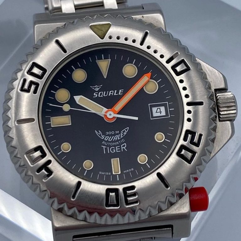
The Squale was cheaper (so easier to buy), smaller (so easier to wear), it featured regular crown and lock button positions (so was easier to use for right-handed users) and it features Squale's usual design traits (so it's easier to read in poor light). Sure, like the Proplof, it answered the need for divers who wanted a locking bezel. But Squale's answer was, well, just better.
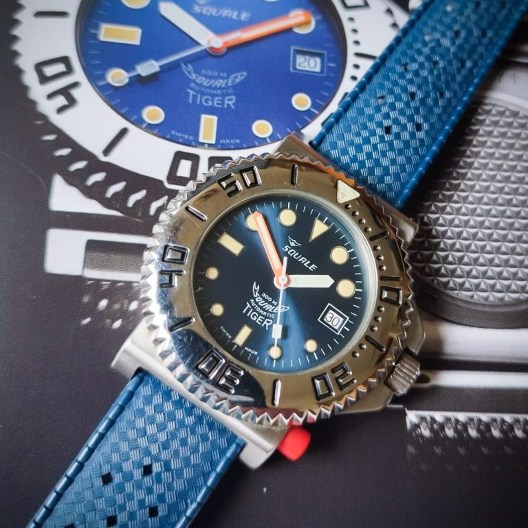
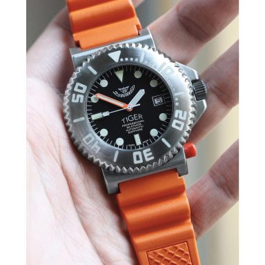
The bezel on this beast comes in at 44mm; so it is a big watch, but it does not look daft-huge like the Omega. Thanks to the special case design, it hugs a small wrist well, and due to its diminutive hight of just 11mm, you can wear it without feeling like you have an alarm clock strapped to your wrist.
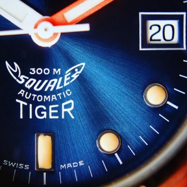
Talking about the bezel; it really is the stand-out feature on the Tiger. No finely milled 'coin edge' like on the 1521 here - no; the Tiger get fat 'saw tooth' edge for ultimate grip. And no fancy two-part construct with acrylic insert like on the Master; just a single piece of bulging metal with deeply engraved numeral markers (topped of with a huge lumed triangle zero marker). The black dial Tiger pictured at the start of this guide is an example made in the 80's. Although is should be noted that these early pieces all had highly polished bezels - so big and so shiny that many folk took a scotch pad to the bezel to hide micro scratches and give a more subtle tool-watch look.
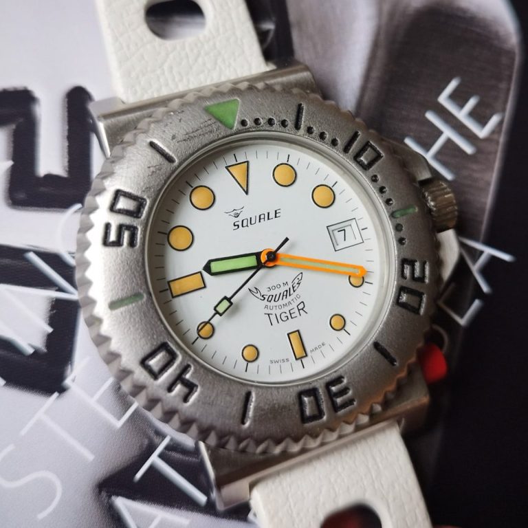
Talking of tool-watches; the Tiger really was just that - the right tool for the job. Non divers who bought these back in the day would often complain that they were uncomfortable to wear. But you have to remember; these were properly designed for divers, and the discomfort desk divers complained about was the knurled caseback - a feature developed to stop the watch from slipping round a slippery wetsuit while diving. So 'man up'!
After the original black dial versions had been on sale for a year or so, some slightly more jazzy versions were released. The most popular being the sunray blue. But there are some proper rarities out there; the white Tiger is harder to find; and there are even some wearing different brands at 12 (and even 9).But sales were flagging. Not just for Squale; for the whole watch industry. But Squale could not balance the books, so closed its factory doors in 1995. And that was the end of the Tiger...
...or was it?
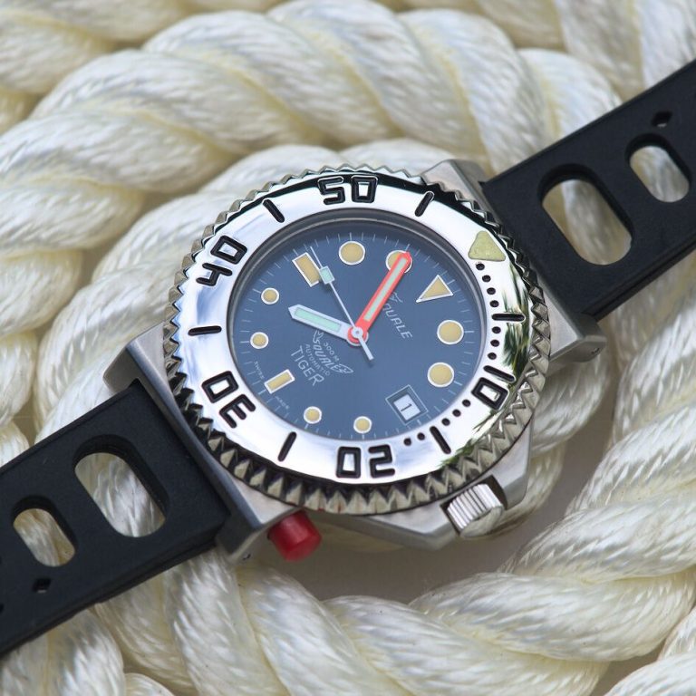
Luckily for those who dig the design, the Tiger came back to life when the Squale brand re-launched in 2007. You see, amongst all the boxes in the warehouse, they found a batch of NOS Tiger cases and dials. These were used to build a short run of Tigers with upgraded ETA movements, and had a more solid build quality than those put together in the early 90's. But even that is not the end of the Tiger story...
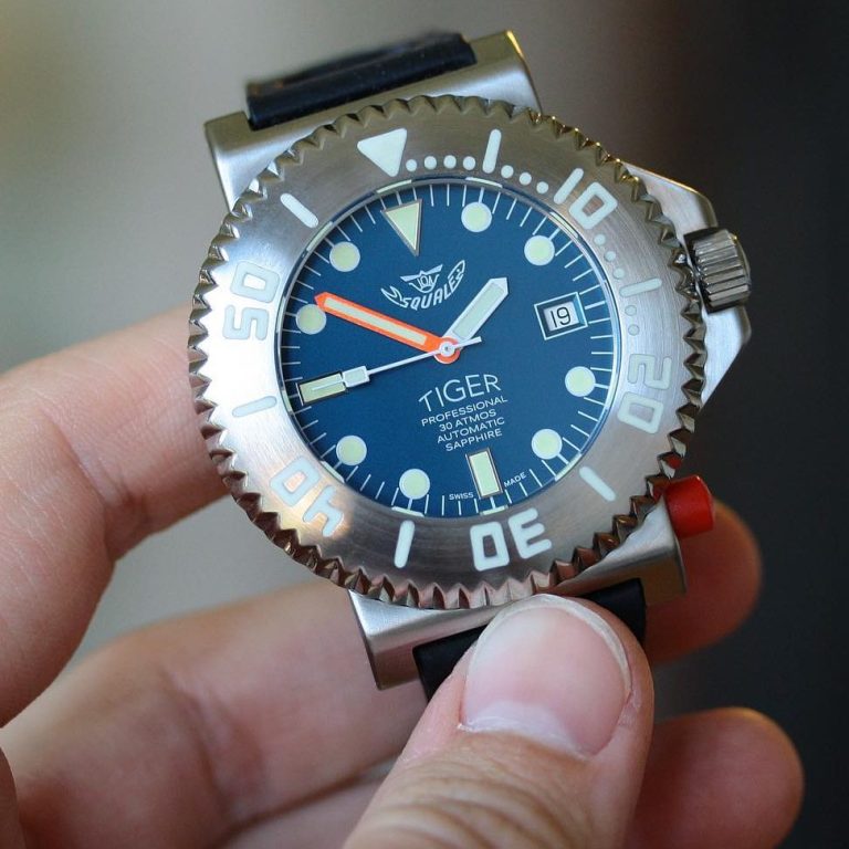
...as in 2016, Squale found 200 bare Tiger cases in deep storage. They were a little bit 'storage bruised', but Squale felt it was worth saving them; and started work on the Tiger LE.
In 2017, the final run of Tigers were released. The cases re blasted, the bezels brushed with lume filled numerals. And brand new dials had been printed which sadly lacked the asymetric marker design, and oddly had the shark logo at 12.
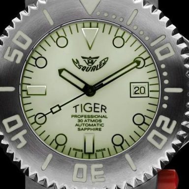
The collector's target is the full lume version.
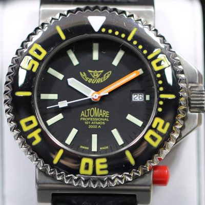
The unicorn for Tiger collectors... a prototype Tiger labeled 'Altomare'. This 101 Atmos Tiger featured a militare style dial and a crazy yellow paint scheme. But after one presentation at a big watch show... it was never seen again.
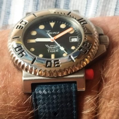
One question people always ask is why the original Tiger had the oddball asymetrical dial design. But more than just looking 'cool', it was actually quite functional; enabling the indicies furthest away from you to be just as easy to see as the ones closest to you. pretty neat, eh!
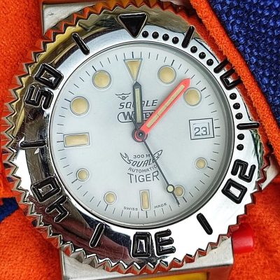
The collector's love finding something nobody else has. And thanfully there are a bunch of Squale Tigers out there with cross branded dials.
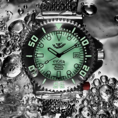
Of the final run of 200 Tigers, the pick of the bunch is the full lume LE.
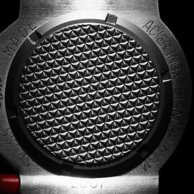
The Tiger's caseback doubles as a handy cheese grater if you are making pasta.
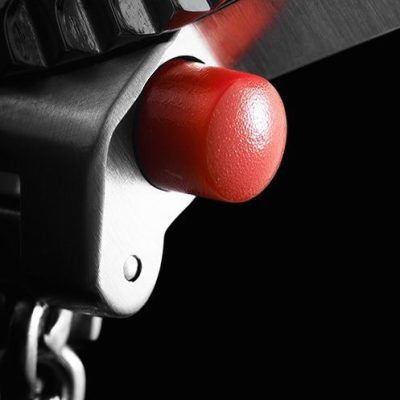
It looks nothing like an Omega... honest.
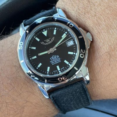
There are some very odd 'City' Tigers out there, too. More oriented to the sporty banker types that used to fill our financial centres back in the 90's. This one features a nice ceramic bezel.
We need your consent to load the translations
We use a third-party service to translate the website content that may collect data about your activity. Please review the details in the privacy policy and accept the service to view the translations.